


A Ptolemaic world map in Web Mercator
Ptolemy would have hated this, but he's not around to complain.

This post could be an image:
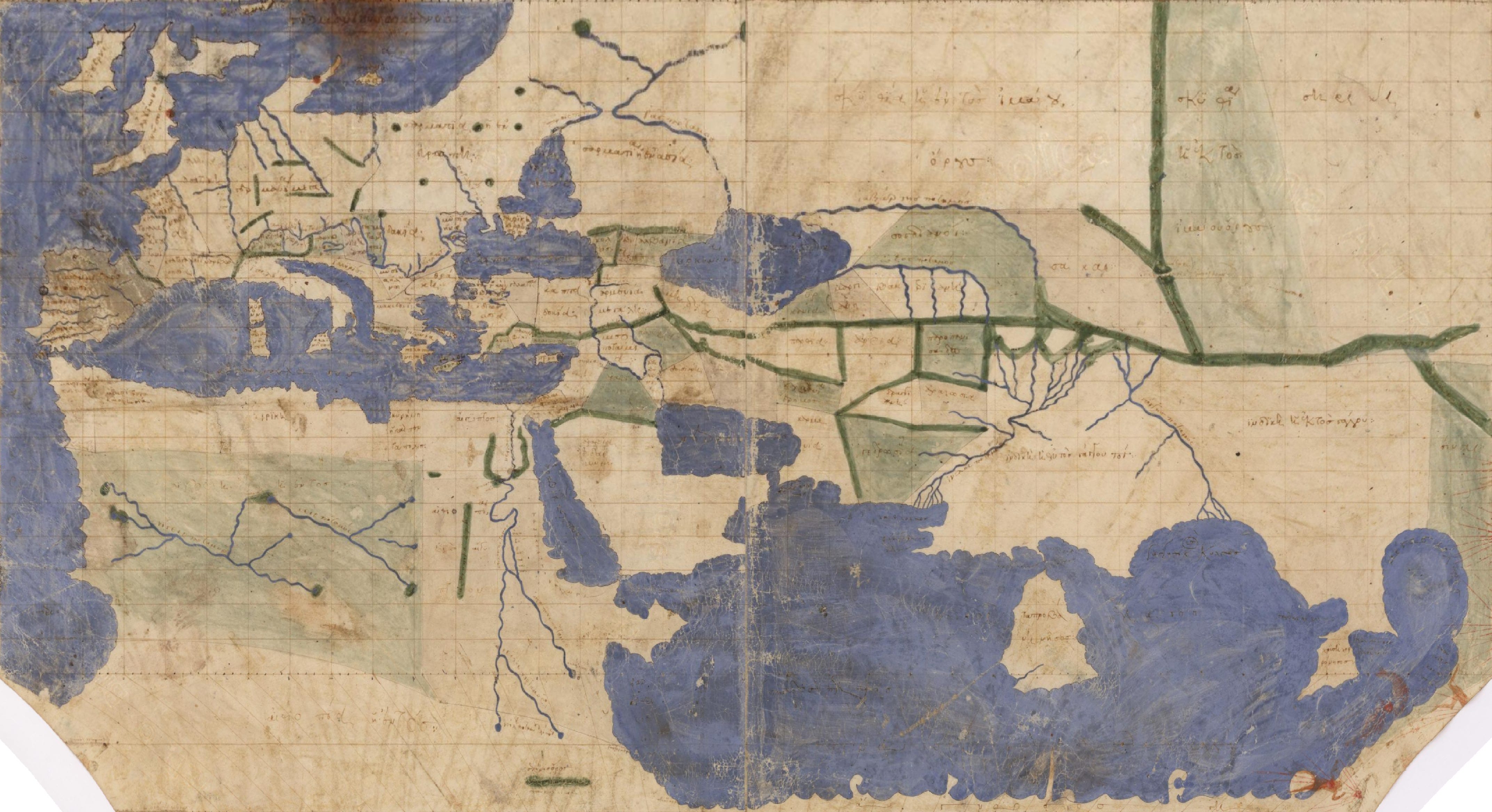
In the age of Bing Maps, we’re used to seeing the world in Web Mercator, with sizes exaggerated towards the polar latitudes. The above map is warped to this projection from a scan of what might be the oldest extant map-containing manuscript of Ptolemy’s Geography. The result looks familiar to my 21st-century eye, at least the western half; Ptolemy clearly knew less about Asia, where I recognise only Big Sri Lanka. (The most detailed part in the far east is I think Thailand and surrounds, which I didn’t get at first glance.)
The drawing’s original conic form exaggerates sizes at the more southern latitudes, where the map dissolves into unknown lands, giving a poorer impression than Ptolemy’s coordinates deserve:
History
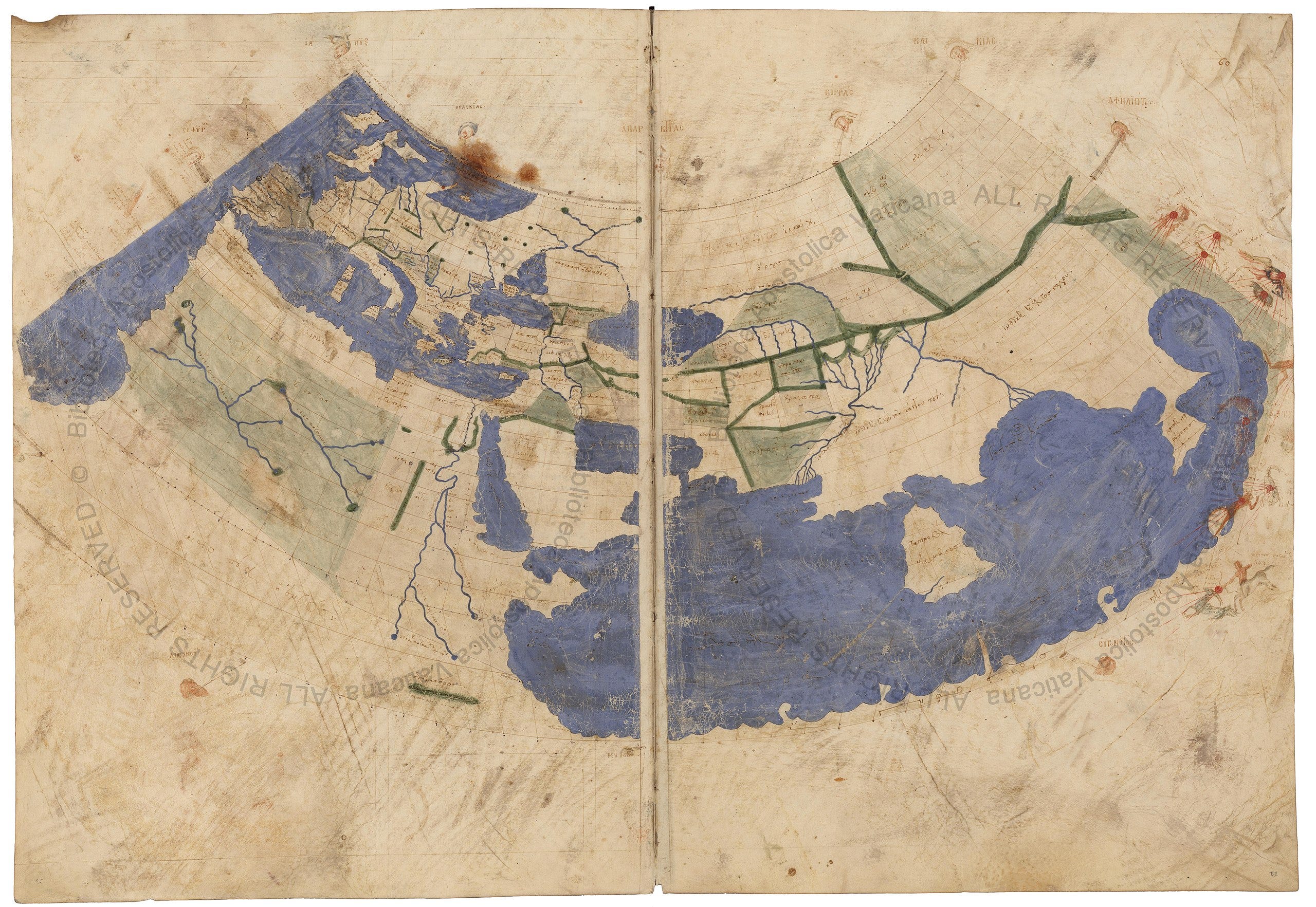
Ptolemy wrote his Geography in about 150 AD. Much of the text of this work consists of latitude and longitude coordinates for towns and coastal features – page after page after page of coordinates, separated into sections that define twenty-six regional maps. These maps were clearly drawn and then copied or redrawn in antiquity. The above map, from the Urb. gr. 82 manuscript in the Vatican, is from around 1300; whether one or more of the ancient maps survived this long, potentially serving as a source for Urb. gr. 82, is a debate that I will not try to adjudicate.
Mittenhuber argues, in a book chapter on the textual and cartographic tradition of the Geography, that Maximus Planudes found maps in a very old manuscript in the late 13th century, and that some elements of the regional maps in Urb. gr. 82 and related manuscripts are inherited from this (lost) older source. Others say that all the Ptolemaic maps we have today are ultimately reconstructions from Ptolemy’s incredibly detailed list of coordinates; since writing is easier than carefully drawing maps, it was always expected that text-only Geography versions would be copied more widely.
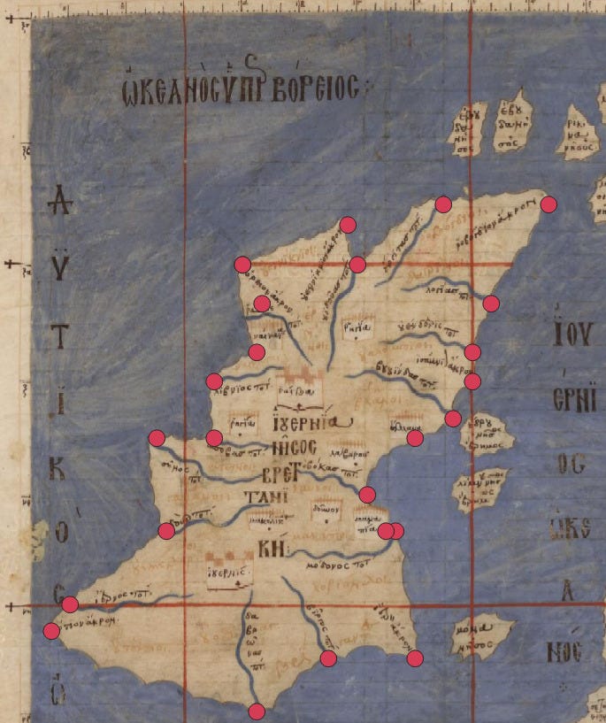
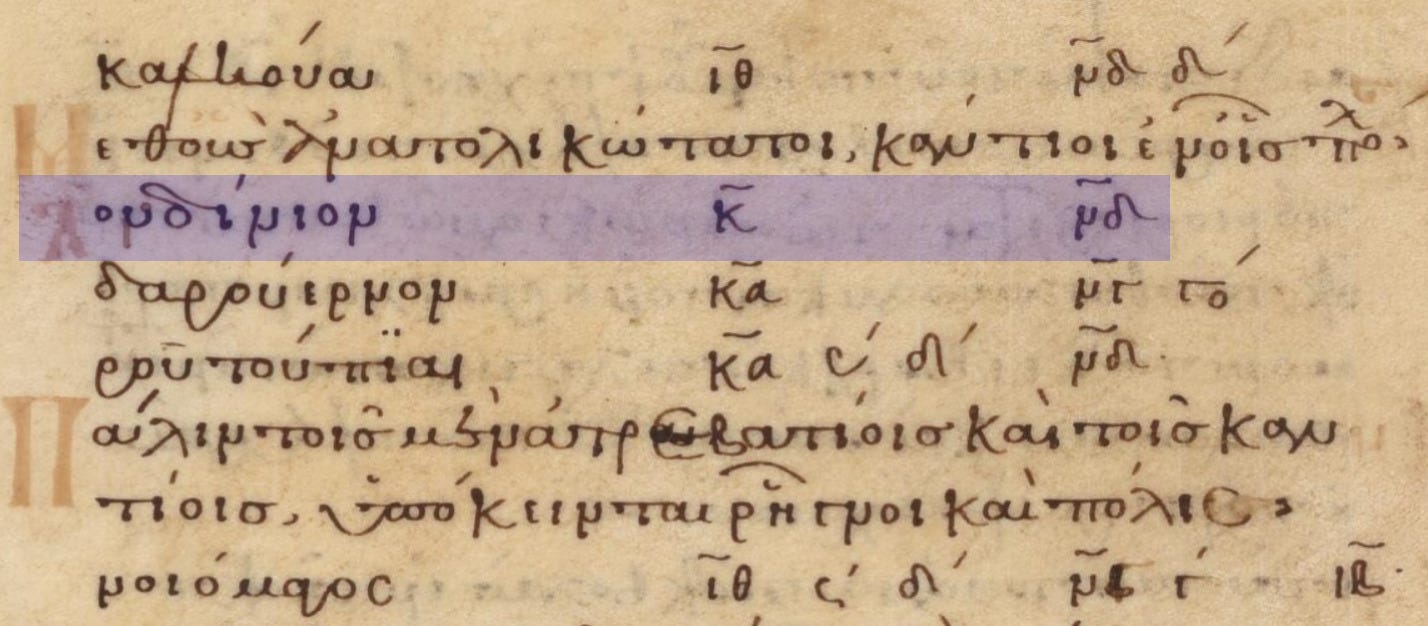
As an illustration of how a reconstruction can work, chosen because it comes first in the text and is quite small, here is the map of Ireland (part of a regional map that also includes Britain) along with the various points located by Ptolemy on the coastline. We can see that the medieval mapmaker has artistically interpolated between the locations, drawn all rivers similarly (only the mouths get coordinates) and overlooked one point in the north-west. Ptolemy gives the smaller surrounding islands only a single longitude and latitude each, so their sizes and shapes are all guesses.
The manuscripts in the Urb. Gr. 82 family apparently contain some corrections to the coordinates. I don’t have a sense of how widespread these changes were and how much they improve (or otherwise) the global-scale map. I made a cursory attempt at studying Vat. Gr. 191 to compare the Irish coastline (starts near the bottom of f. 138v), but the scan is very smudged and I couldn’t match up all of the lines; there were clearly some differences. Regardless, any Byzantine improvements left plenty of errors, such as Scotland veering off at the wrong angle, and the problems with longitudes described later.
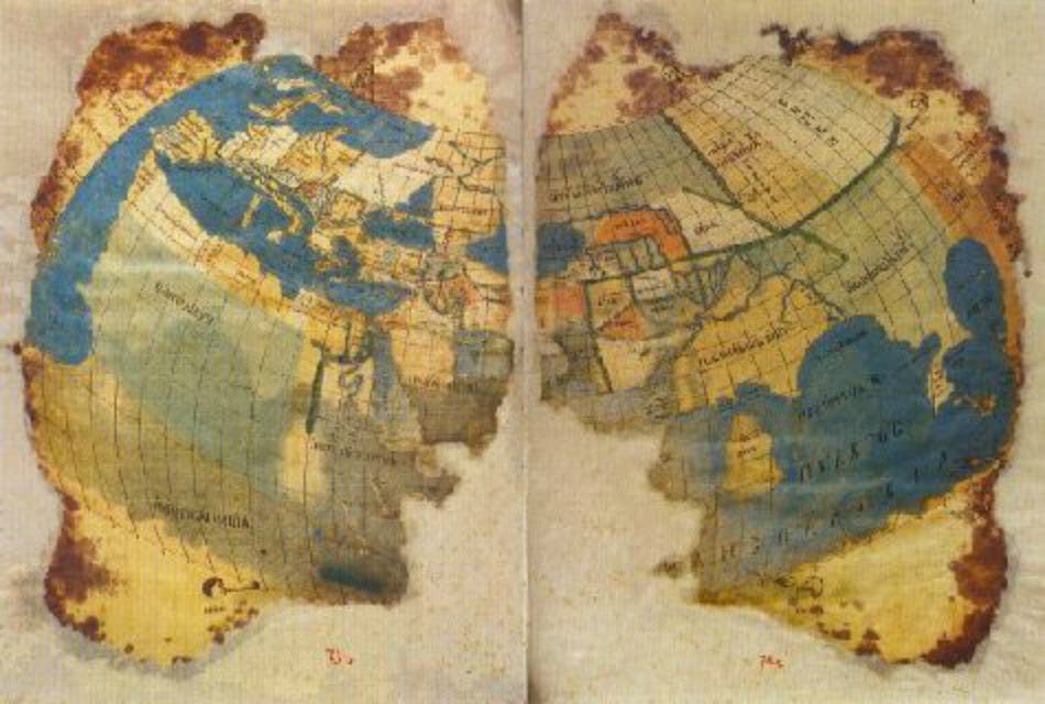
The conic projection was in fact not Ptolemy’s favourite; he described how to construct it because the straight meridians would be easier for people than the curved meridians of his preferred projection. Wikipedia has a photo of a damaged map drawn at around the same time to this latter specification; the full manuscript (Seragliensis Gİ 57) is not online. It looks stylistically modern, with brilliant colour:
Numbers
Numbers in the Geography are written with Greek numerals. While working on my previous post, on prime numbers, I became quite good at reading the odd units digits; now I have more proficiency with even numbers and also the tens digits.
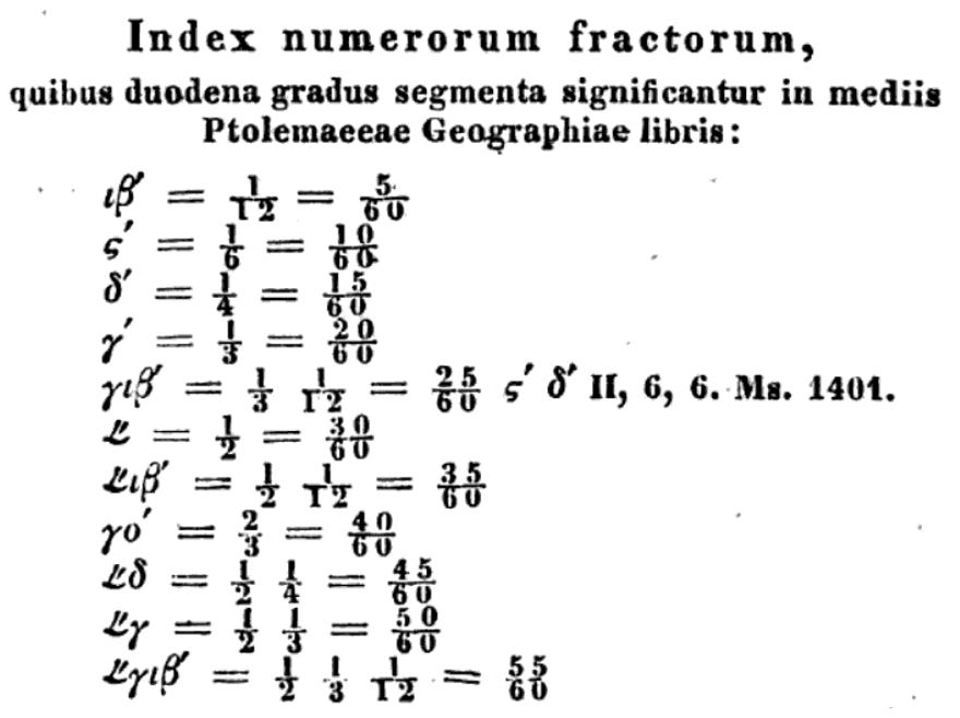
Longitudes and latitudes are given to the nearest 12th of a degree. Despite Ptolemy using a base-60 representation in the Almagest (corresponding to modern-ish degree-minute-second form), in the Geography we get fractions of a degree represented as fractions. With the exception of two-thirds, which has its own irregular form, fractions that don’t have 1 in the numerator are represented as a concatenation of fractions which do have 1 in the numerator. For example, 5/12 is the symbol for 1/3 followed by the symbol(s) for 1/12, or alternatively the symbol for 1/6 followed by the symbol for 1/4.
One-half gets its own special symbol, but my ordinary Windows installation doesn’t contain the necessary font to display its unicode character. So instead, here is a screenshot of a handy guide from Nobbe’s 1843 Greek edition of Geography for anyone who wants to read the longitudes and latitudes:
Longitudes
The meridian defining zero longitude is arbitrary. Ptolemy placed the zero somewhat to the west of where it is in today’s system, allowing all the places he knew about to have positive longitudes less than 180°; London is at 20°.
Both the world map and the regional maps in Urb. Gr. 82 have ruled red lines of longitude every five degrees.
Determining the longitude of one’s position was a famously difficult problem, only solved in the 18th century, so we might expect and forgive inaccuracies made more than 1500 years earlier. But Ptolemy’s longitudinal errors were stranger: he appropriately based his numbers on measured or estimated distances along parallels of latitude, converting these distances to degrees. But he used a circumference of the earth that was substantially too small, leading to a systematic over-estimation of the difference in longitude between pairs of locations.
Hundreds of years earlier, Eratosthenes had calculated the distance of one degree along a meridian as about 700 stadia, for a circumference of about 252,000 stadia. We don’t know exactly how long a Greek stadion was, but none of the estimates I’ve seen suggest an error in Eratosthenes’ circumference of much more than 10%, and it may be within 1%.
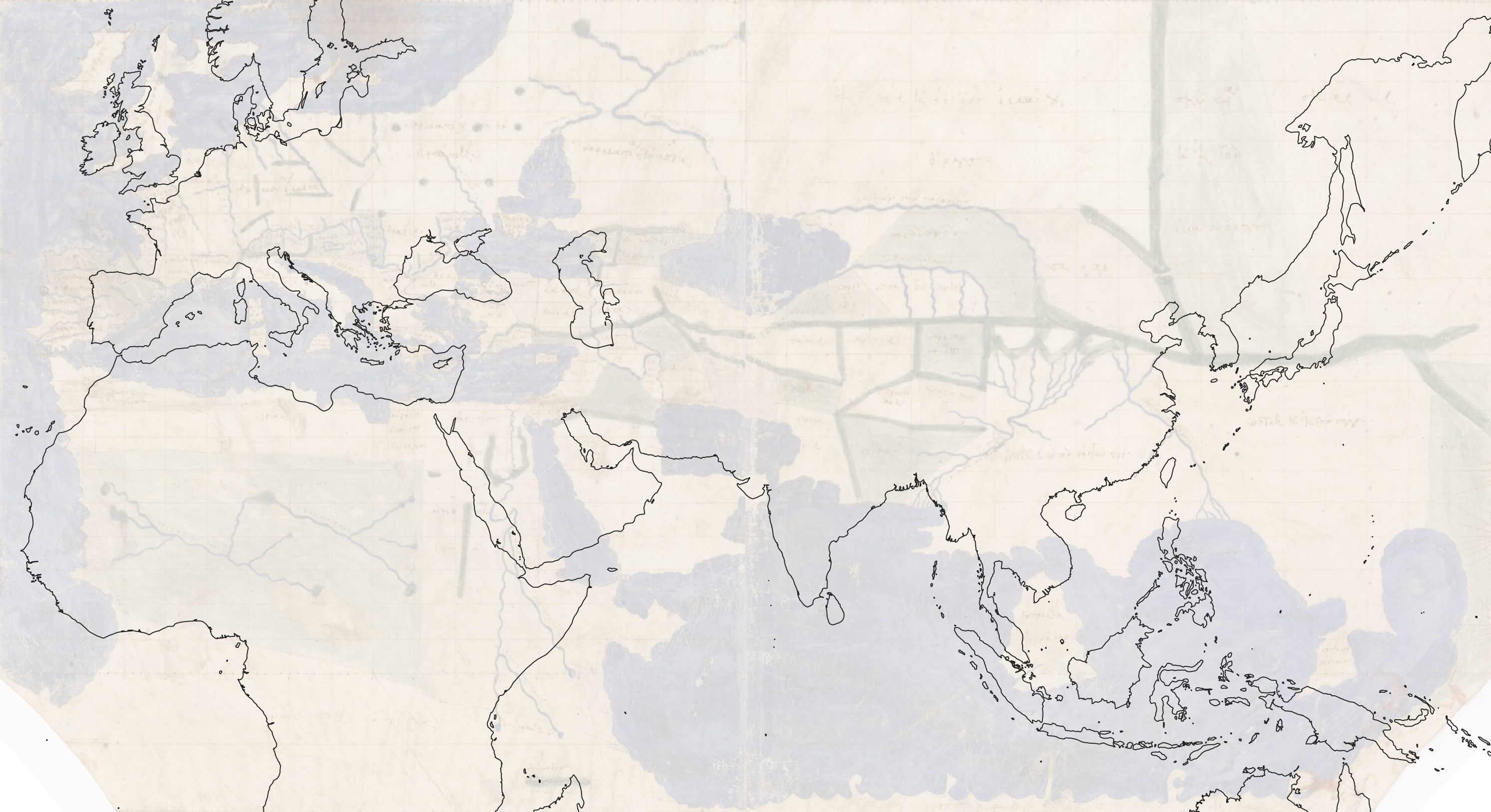
Ptolemy by contrast used 500 stadia to the degree of latitude. Here is a comparison of the Ptolemaic map with what we know today (I’ve shifted Ptolemy’s longitudes so that London is at zero); note how far away Big Sri Lanka is from its modern counterpart:
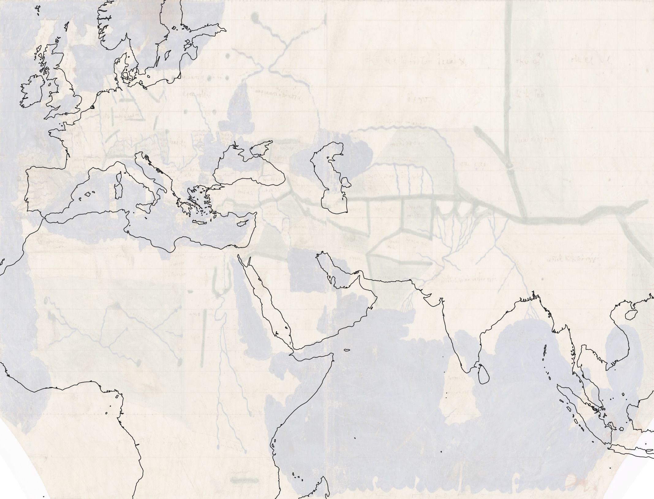
And here is the same comparison after multiplying Ptolemy’s longitudes by 5/7:
Wikipedia cites Russo (2013), which contains a scatterplot of longitudes, Ptolemy’s versus today’s, for a selection of identifiable towns. It shows a close correlation and a regression line with a slope of 1.428 ≈ 7/5.
Latitudes
The red parallels of latitude in the maps are not regularly spaced. Ptolemy gives instructions for which parallels to draw, presumably to serve as useful references in some of the regional maps.
In what was a great puzzle for me, he describes latitudes both in units of degrees and of hours. Four and a quarter degrees north of the equator is a quarter of an hour. Half an hour is 8° 25′. I couldn’t immediately make sense of these equivalences, and asked o4-mini-high, which said that the times were the length of the longest day of the year at that latitude, minus 12 hours. I honestly thought that this was a confabulation until I checked the formula it gave against Ptolemy’s remaining latitude-time pairs, seeing near-perfect agreement.
So that you may appreciate how good the Greeks were at geometry, I would recommend pausing for a moment to see if you can derive a formula for the length of the longest day of the year given the latitude (the formula is in the o4 link above). I managed to do this, after struggling with the 3D visualisation for a while, but I used a rotation matrix and both sine and cosine functions; Ptolemy had only developed a sine function. I haven’t tried to find out how he did these calculations; perhaps an explanation is in the Almagest.
One necessary input to the formula is the Earth’s axial tilt. That Ptolemy could figure this out as well also surprised me at first, but on some more reflection I understood. Once you notice the changing angles of the sun through the year, you might hit upon a mental picture of a stationary spherical earth spinning on an axis not perpendicular to the orbit of the sun around it, and then you can find correct ways to measure various angles.
The angle of a shadow cast at solar noon on an equinox will be the latitude. Outside the tropics (and the polar circles), the shadow’s angle at the summer solstice will be the latitude minus the earth’s tilt; at the winter solstice it will be the latitude plus the earth’s tilt.
Given the relative ease of measuring latitudes, I’m a little surprised that we see some errors in them; perhaps no-one in Roman Britain was measuring shadows at solar noons and reporting angles back to Alexandria, or perhaps it was raining.
I didn’t actually read the English translation of the Geography (by all accounts a poor one) before starting to study the maps; I studied the maps themselves, trying to figure out their logic. Where a parallel was not drawn at an integer number of degrees, I counted pixels to estimate the latitude.
This proved to be a useful exercise, because Urb. Gr. 82 has a couple of parallels drawn at different latitudes to those in the English translation (or, indeed, to Nobbe’s Greek edition). When I did eventually compare my estimates to the text values, I could fix up my slightly-wrong estimates and double-check the substantial discrepancies.

Warping to Web Mercator
I used the QGIS Georeferencer to set most of the lon-lat points, doing some extrapolation for the points outside the bounds of the image, included to try to avoid edge effects if the warping had to go past a control point.

I used a thin-plate spline transformation; the default linear transformation leads to many artefacts.
Some of the control points might be a few pixels off: the lines sometimes disappear in the ocean.
Once I had a georeferenced tiff file in EPSG 4326, I cropped it to the extents of the map, did the same for the second image, and then merged them. This is all possible in QGIS, but because I knew I’d be doing this twice – the second time with the scaled longitudes – I spent about eight hours getting it going in command-line with gdal, thereby saving myself a few minutes of clicking around in the QGIS raster menus.
For the warping to Web Mercator, I used QGIS’s on-the-fly reprojection. With the Project menu’s Export Map to Image, I set the extent to the bounds of one of the raster layer, which avoided the need to compute Web Mercator coordinates. To get the faded look for the comparison with the shapefile overlay, I used o4-mini-high’s simple suggestion of reducing the raster layer’s opacity.
I set the red, green, and blue colour channels to range from 0 to 255; sometimes when doing operations in QGIS I ended up with substantially distorted colours defined between smaller bounds, which is presumably what happened in an older version of the Wikipedia map.
That’s very cool.